Design for Concert Apps Pt. 2 — Competitive Analysis

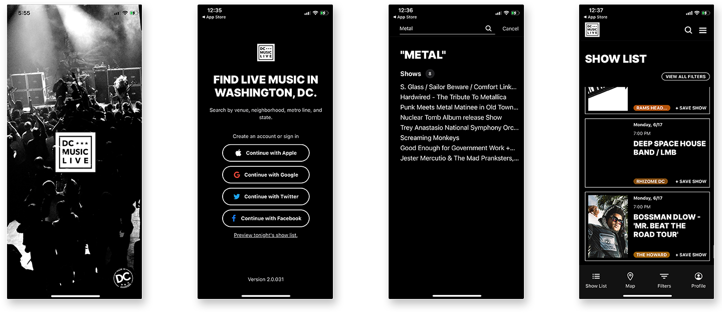
In 2021 an app was announced that was basically exactly what MetalBard is, but for the entire DC music scene: DC Music Live. This was a bittersweet occasion: finally I would have a way to keep track of local shows on my phone, but I was disappointed in myself for not having completed MetalBard and letting another developer eat my lunch, so to speak.
This is Part 2 of a series on the unique design considerations raised by concert apps. Read Part 1 here.

I instantly downloaded the app and have checked in on its development progress every once in a while ever since. It's important to me to understand MetalBard's place in the ecosystem of music apps, especially when an application exists that's so similar. However, I always bounced off DC Music Live, and there are a few reasons for that that I think are worth dissecting here.
From a visual design perspective, I think DC Music Live is fantastic. Dark colors, high contrasts, clear text. When the app first launched, it looked a lot like Google Maps: bland, white, and dreary, but it's come a long way.
But from a user experience perspective, hard choices are made as a result of the app's larger scope. When someone first opens the app, they're asked to create a profile, selecting what genres of music they're interested in. Because creating a lean, quick user experience was critical to the way I saw MetalBard, we forego all of this. We don't need to know who you are or what kind of music you came here for. You're a metalhead and you're looking for metal.
This is another choice that could explode in the face of MetalBard, but we're also not interested in linking with social media or collecting email addresses. Metalheads use social media as much as anyone else, it's true, and more robust sharing options are definitely on the roadmap, but this isn't about data collection or selling ads. It's a small, vibrant community, and the app's scope needs to reflect that.
