Demon Cat Lives! And He's Napping in the Window...
All over these United States one hears about local cryptids (an animal that has been claimed, but never proven, to exist), some more famous than others. West Virginia has the supernatural Mothman. Even our neighbors in Delaware have the Selbyville Swamp Monster to call their own. Here in DC we have, well, Demon Cat.
With a name like an ’80s hair band and a terrible pun (DC. Demon Cat. Get it?) it's hard to feel like an overgrown black cat really represents a District of 600,000 people. And that's what made it the perfect mascot for a uniquely terrible bar trivia team.
When my roommate and I moved into the city, we decided to visit our local haunt at Atlas Brew Works for their bar trivia. They served great beers that they brewed on site, the place was rarely crowded, and they occasionally had metal shows going on in the back room. Also notable: they offered a dubious last place “prize,” which was usually whatever they could find around the bar at the last minute.
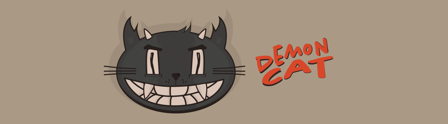
After a few weeks using the Demon Cat name, I decided I'd try to create a simple illustration of the cryptid. I started from a football shape, demon horns, and a wall-eyed stare. A friend took one look at it and asked if I'd ever seen a cat before.
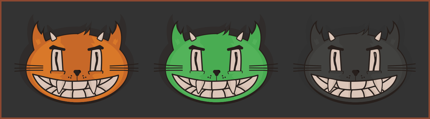
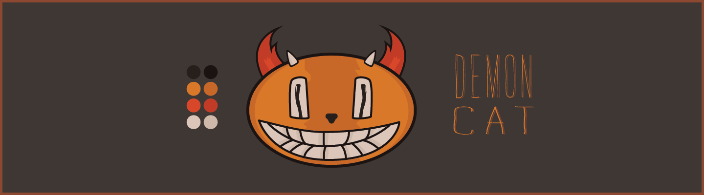
I refined the design and tried a few variations in color scheme. I have orange cats, so I leaned that way with my design. But he's a demon, I thought. Surely he should be a sinister green. Finally, I decided to stick with existing depictions of our local demon cat, and made him an off-black color.
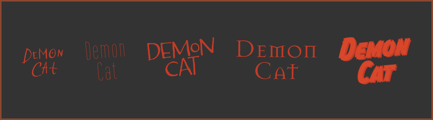
Choosing the accompanying typography was a challenge for me. I went through a number of options. I tried scratchy fonts to reflect a cat's scratch, hand-drawn fonts to evoke the slapdash nature of the team, and demonic fonts to call to mind another local favorite: the Exorcist.
I liked the idea of tying the look into classic movie designs, but Demon Cat was just too cheesy to be associated with such an iconic film. He was more like a 1950s creature feature. I looked at old movie posters, including the one for the iconic schlocky giant ant movie "Them!", and knew I was heading the right direction.
I ended up using a font called Chantal Bold, and nudging the characters around slightly to give it a more compact appearance.
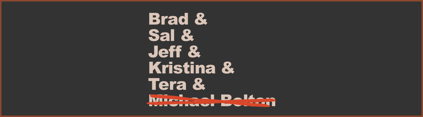
As the weeks wore on and the team grew, I thought of doing t-shirts for all of us. My first thought was a riff on this overused, Etsy-y list of names and ampersands. Looking at it I realized sometimes when you try to riff on something, you can end up just replicating it with all its flaws.
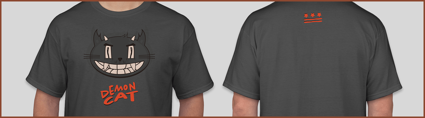
I decided ultimately to just use a simplified version of the DC flag. It's such an effective design: it isn't widely known but people who live around here will recognize it anywhere. All I had to do was recreate it in a way that matched the text I had chosen.
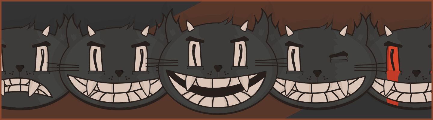
I ended up using this Demon Cat illustration all over the place. I used it as my profile picture in a lot of places and I created stickers in a number of different styles. As the number of applications for the little guy grew, I decided to create a number of variations. A personal favorite is the "tears of blood" one, which I used in JQBX (rest in peace) whenever I was playing music.