Design for Concert Apps Pt. 1 — Mobile First

I did the hard work of testing MetalBard in dingy bars and darkened concert venues to bring you the user research you can't get anywhere else.
Live music is unlike any other experience. If I told you that for around fifty bucks you could stand for hours in the dark surrounded by strangers while bright lights are shone directly into your eyeballs and loud sounds pummel your ears and brain, you would look at me like I was crazy. In the DC area and around the world, people are signing up for that unique ordeal each and every night.
As designers, we owe it to people to be cognizant of how their circumstances and stressors can affect how they experience our apps, and using a phone application before, during, or after a concert poses a very specific set of challenges. It also offers some exciting opportunities to perfectly tailor our experiences to the needs of our users.
A Brief History of Mobile-First Design
In the beginning, the web could be viewed only in the cool light of the cathode ray tube (those old beige monitors people had in the 90's), and the webmasters, as they called themselves, saw that it was good.
Shortly after the turn of the millennium, cell phones became ubiquitous, a Nokia brick in the pocket of every child. And those people wanted to use the internet on them. Designers set up subdomains (something like m.google.com) that mobile users would be redirected to when they accessed websites: a whole second site specifically for the low bandwidth and tiny screens of early cell phones.
Enter the smart phone, around 2010, and everything changed. Suddenly the screens in people's pockets were higher resolution than those old beige monitors ever were, and people who didn't have internet in their house now had it in the palm of their hand.
A number of philosophies cropped up to deal with the novel use cases that this paradigm shift created, some competing with one another, some building on existing ideas. "Well," thought some, "we spent all this time making beautiful web sites for big screens. Let's just make sure it's functional on smaller screens and it'll be fine." "No!" shouted others, "Mobile is the wave of the future; web sites must be built for phones first, lest we be left in the detritus of time." It's possible I'm remembering some of these articles being more dramatic than they were.
So, where did we land? As with all things to do with UX design, it depends. As Patrick Clancey writes for A List Apart, "things can easily get convoluted and less efficient if we prioritize one particular device—any device—over others."
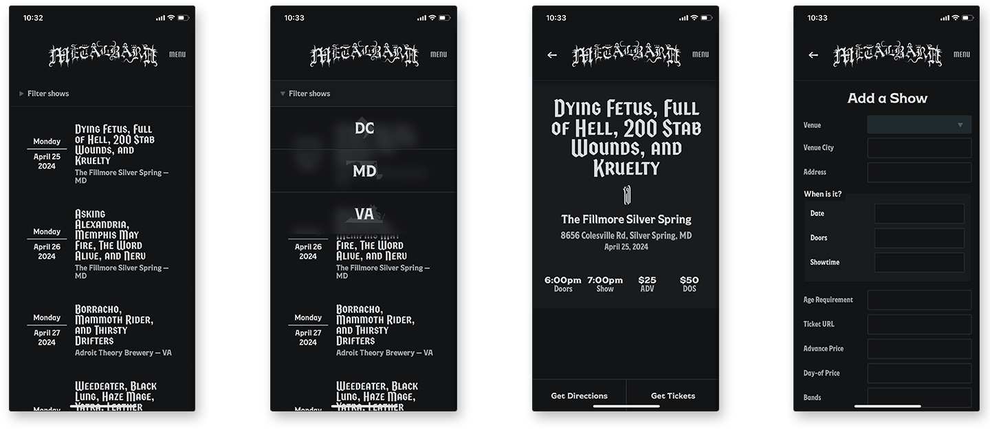
When I began work on MetalBard, it was with these decades of context in mind. I thought it was important that the application work on whatever device the user was coming to it on. One of the things I find interesting about MetalBard, however, is the surgical precision of trying to target very specific use cases, and cater to them perfectly. It could have been an app for finding metal shows in your area, wherever that may be. It could have been an app for finding all concerts in the DMV (District, Maryland, and Virginia) area. But it wasn't; it was a specific app for a specific type of user, in a specific circumstance, and that meant focusing on mobile design. As a result, MetalBard is not only one of the only mobile-first applications I've ever designed, it's also almost mobile-only. It's a gamble, and time will tell if it ever even made sense in the first place.