Total Wine & More: Photon Logo

This little case study is a great microcosm of how designers can always use their creativity, even when working within an established, rigid design system. In the end I designed a fairly simple logo, but a lot of thought went into it, and I'd love to share it with you.
At Total Wine & More, I worked on a new application, code-named Photon. The app was intended for a power-user audience, but we still wanted it to reflect Total Wine & More's commitment to sleek, modern design. I was assigned to create a logo to represent our app.

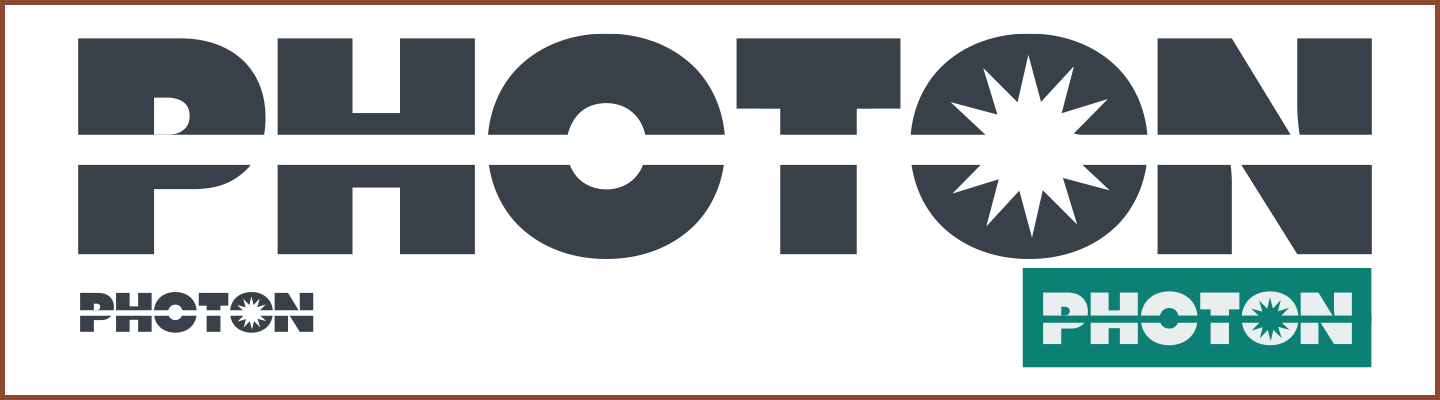
My first instinct, because the app was internal and Photon was just a temporary code-name, was to use the strong typography and colors that are at the core of Total Wine & More's design system to create something functional, if not especially exciting.
As we began to evangelize our application internally, we felt that it needed a logo that more accurately reflected its name. I sat down and wondered, what is a photon? Scientifically speaking, what is it? I turned to trusty old Wikipedia, and I'll be honest: the vast majority of the article on photons went clear over my head. Simply put, to my understanding, a photon is a particle of light, so I took that idea and ran with it.
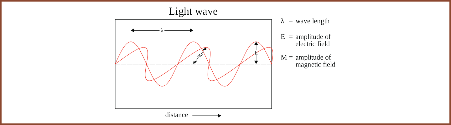
This version of the logo was bolder, stronger, and had that mid-century vibe I really enjoy. I used Futura Bold to create that chunky look. The only issue that really stuck in my craw was that it reminded me more of an energy company, especially the old Texaco logo. It communicated a seriousness that I liked, but it still wasn't right. I returned to the Wikipedia page and found this diagram:
That's the basis of a strong design already, I thought to myself. Pattern is one of the principles of design, and what stronger pattern could there be than light itself, depicted as a wave? I sat down with a paper and pencil to play with this new idea and before long ended up with a design like this:
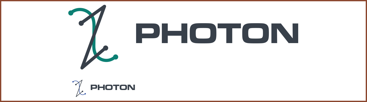
I found myself now leaning almost in the opposite direction of my earlier design, this time into the world of science fiction with Eurostile as my font and these abstract lines that seemed to have no relation at all to the text. "This is even worse," I thought. "There has to be a common ground."
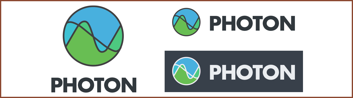
I brought Futura back in (it's one of my favorite fonts), and used colors that were derivative of the Total Wine green but not exactly the same. I made the lines of the logo bolder and more deliberate. The waveform of the photon was now enclosed in a tidy circle so the lines didn't seem to just be floating.
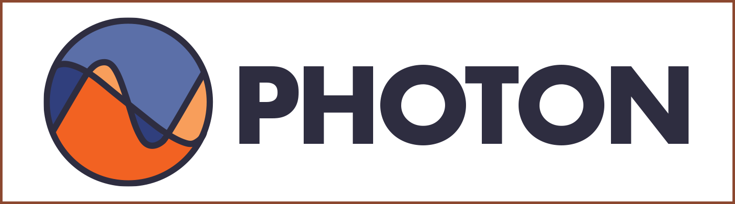
After a little more tweaking, this is essentially the logo we landed on. We ended up not using the Futura text in the application, and using Total Wine colors in the logo in most places, but I felt this was the strongest version of the logo. The lines in the circle have been made even bolder and a deep, almost black, purple is used throughout. Finally, orange and blue are a classic complimentary color pair, and here their slightly muted forms remind me of retro-futuristic depictions of mountains on the surface of Mars.
I'm sure I'm getting away from myself a bit here, in my description of this simple logo. Ultimately we ended up using Total Wine branding fonts and colors to fit the logo into the application, but I feel that this creative process is what led us to a successful logo, and without these iterations it would have never worked. So, this is just a short case study to remind myself and others that it's important to always stretch your creative legs, even when working within an existing design system.