Colorblind Accessibility in Magic: The Gathering
This post is a little bit outside my normal wheelhouse, pertaining to a physical card game. I know it seems to have little to do with web accessibility, but I believe it's important to look to other media to see the problems they face in design and the solutions their creators employ. This article explores one example of a common design problem that has been on my mind for a while.
Popular trading card game Magic: The Gathering is unfortunately not usually accessible to those with limited or no vision. Despite this, there has been a concerted effort in the design of the game's cards to be accessible to the color-blind, and even at least one Magic artist is himself colorblind.
First, the basics. Cards in Magic typically fall into one of five colors. These colors together are called the Color Pie. The colors typically have different philosophies and ultimately win the game in different ways: green focuses on large monsters, white focuses on healing or preventing damage, etc. As a result, it's very important to know what color your cards and your opponents' cards are. So, how do we do that if we don't perceive color?
Magic's designers had a solution: the colors all have associated symbols.
These symbols have changed only very slightly over the course of Magic's almost 30-year history. This is one of many smart design choices that have pointed towards consistency in experience.
Let's look at an example. This is Savannah Lions, first printed in 1993 and most recently reprinted (as of this writing) in 2024.
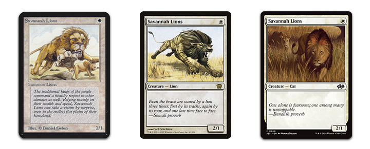
A number of things have changed in the thirty-some-year life of the Savannah Lions, but a few notable things have not. The name of the card is the same, the symbol in the top right indicating its "mana cost", and it's stats in the bottom right corner. All of the design elements which are key to gameplay have remained unchanged. This is important because the cards are, in a sense, an interface, and consistency is crucial.
In the long years since Magic's introduction, the game has increased in complexity and there are now estimated to be around 30,000 unique cards. Some cards have front and back sides, some have two "cards" on one side, and some combine multiple physical cards to form one large "card." Through all these changes and expansions, the fundamental basics of the design of a Magic card have typically not changed. When they do change, it's usually for the better, making cards more legible and more beautiful.
There's one exception that I'd like to talk about. What happens if the card has no indicator in the top right corner? What if it has no mana cost, but still has a color? How does someone with limited color vision tell what color the card is? Let's look at another, more recent example: Pact of Negation.
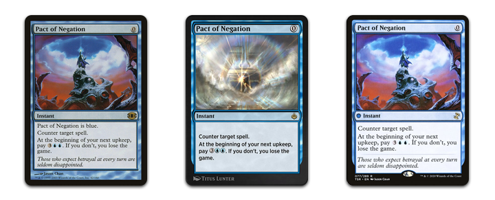
In the first of these images, we see a solution. The text of the card simply says "Pact of Negation is blue." This is a simple, if not especially elegant solution. Is this card affected by Red Elemental Blast? Red Elemental Blast reads, in part, "counter target blue spell." As Pact of Negation says, Pact of Negation is blue. Problem solved.
Evidently someone on the design team agreed with me that this solution wasn't especially elegant, and the text "Pact of Negation is blue" has been removed from subsequent printings. In the online rendition of Magic: The Gathering, Arena, there is no indication at all of what color Pact is. On the physical cards, only a tiny vestige remains: a blue dot next to the card's type ("Instant"). But this is no help at all to the colorblind.

Rendering the card in grayscale, we can see that there is no indication at all that this card is blue.
Let's look at another example. MTG Salvation user Kar3w posited way back in 2011 that these color indicators were a poor design choice. They pointed to the backs of double-sided cards, which have no mana cost. The problem is evident when you look at their example: Civilized Scholar, which transforms into Homicidal Brute.
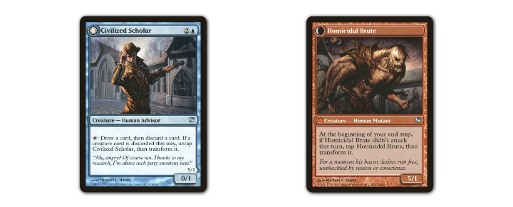
We can tell easily that Civilized Scholar is a blue card by the blue mana symbol in its mana cost (top right). But when its transformation is triggered and it becomes Homicidal Brute, there is no indication that it has become a red card other than its physical color. It's estimated that 8% of men and 0.4% of women globally have some red-green color deficiency.
8% of men and 0.4% of women may not seem like a lot, but that means that about 27 million Americans wouldn't know that they can kill their opponent's Homicidal Brute with a Blue Elemental Blast (which reads, in part, "Destroy target red permanent").
So what's the solution? I don't have a perfect, elegant design solution for this problem. Many accessibility problems don't have perfect, elegant solutions. But I do know one solution, though it may not be especially elegant.